REPLENIX 2025 Refresh
For the launch of the brand new Tranexamic Acid Dark Spot Eraser, I was tasked with doing a mini refresh of the brand. Replenix to me felt like an elevated and classic brand, I wanted something that felt updated and luxurious with elements of fun. Part of what I felt would modernize Replenix more was adding fun pops of color, I felt it would make us more approachable to the consumer. I also used thin line work and italic serif fonts to bring in an almost vintage natural scientific feel.
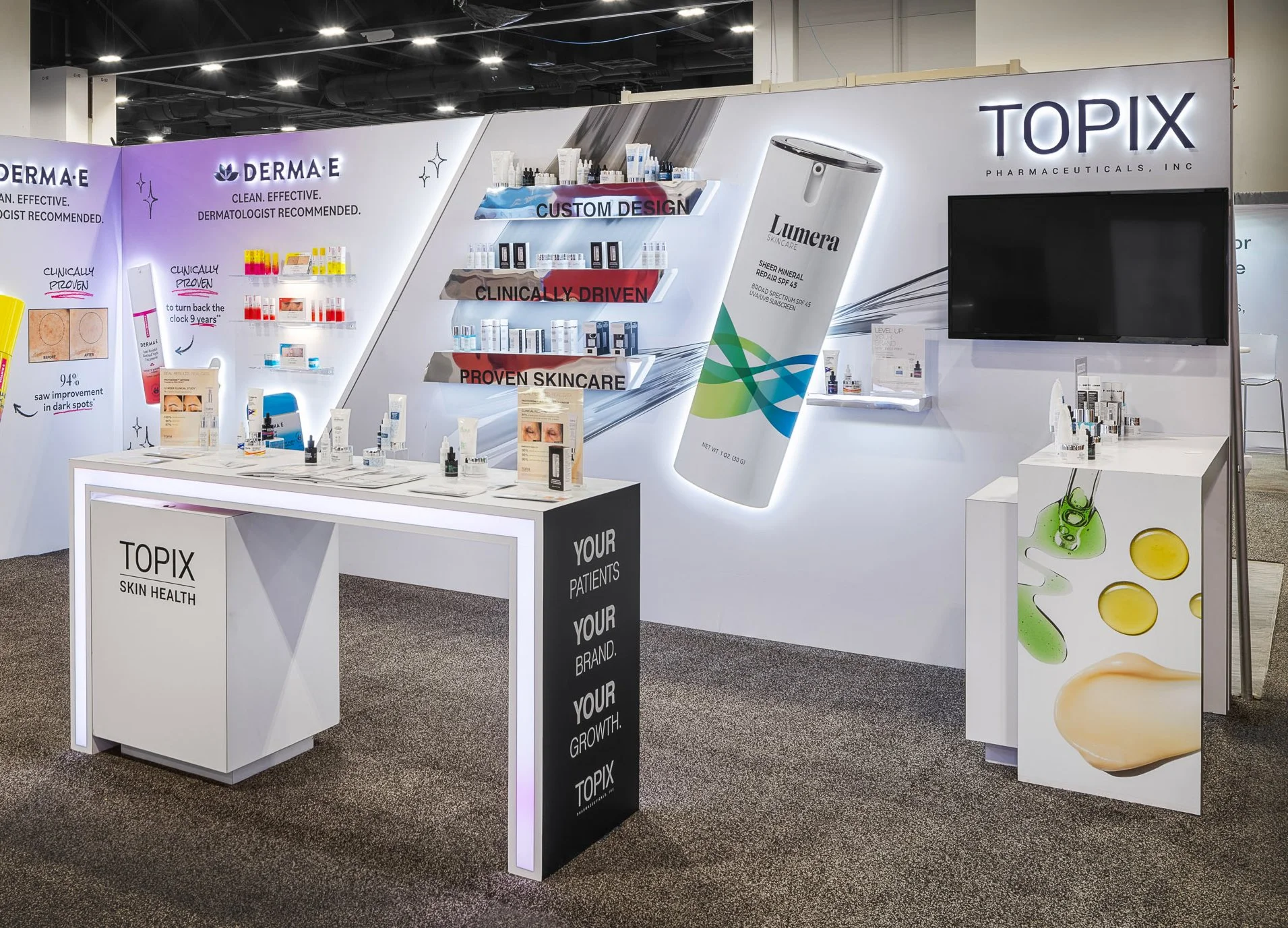
TOPIX AAD 2026 Booth Design
Tasked with creating a more modern and stand out booth design for TOPIX. TOPIX branding is known to be very neutral and clean, this is because TOPIX is a Private Label brand. This presents a challenge as color incorporation and imagery cannot be too loud. The point of the neutrality in branding is to help customers imagine their brand and use imagery that will not clash with their individual branding. I wanted to tell a story through our booth, so I implemented the silver ribbon to almost lead you through who we are. The ribbon takes your eye from the top, tells you what makes our brand better, shows you an example of what we can create for your packaging, then leads you right over to our logo and a video with even more information.